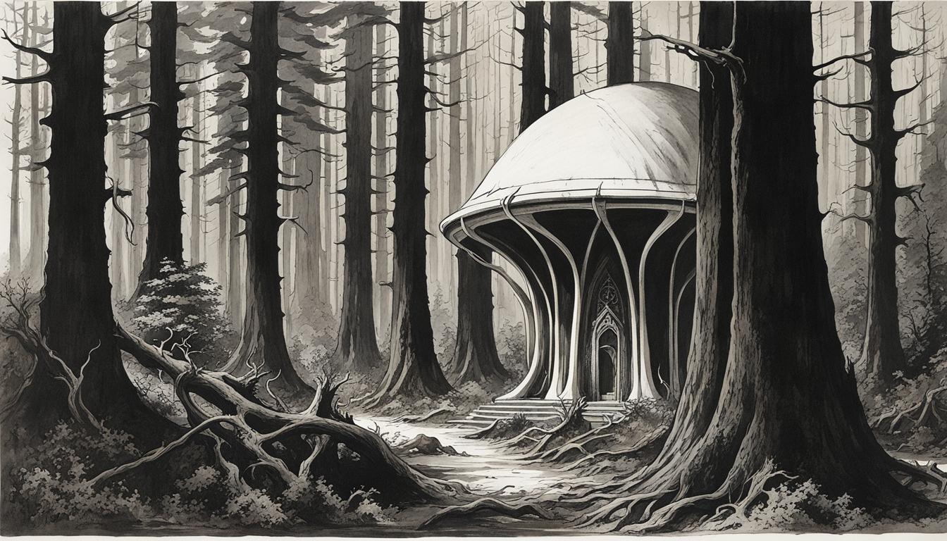
When I was younger and didn’t know any better, I used to find monochromatic images somewhat pretentious. I remember thinking that many images and photographs were probably rendered in monochrome just to increase their artistic value. The choice to use fewer colors when the technology existed to use the full spectrum always puzzled me. Now that I know better, I appreciate that monochrome is an application of the ‘less is more’ rule.
While discussing the ‘Butterflies’ image in the previous article, I noted that “monochromatic images … trim away needless detail and immediately draw attention to the core theme.” For example, is coloring the sky blue (or black) really necessary when you’ve drawn outlines of clouds? This doesn’t mean that color is meaningless. Monochrome just lends itself easily to stark compositions. I’d like to give some examples with the images in this article.
Clicking on the images below will take you to the image posts on NightCafe. You can also view some of my other creations by visiting my NightCafe profile page.
Center of Gravity
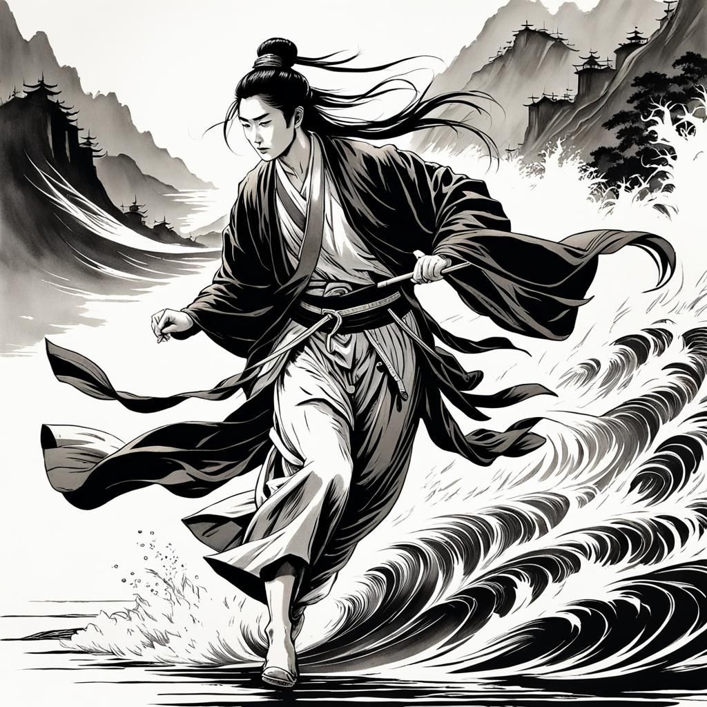
Composition: “running on water full body action (1.5)”
“wuxia ancient china poster art (1.2)”
Modifier: “Using traditional ink, pen and brush techniques. Hatching, cross-hatching and stippling techniques to create depth, texture, and shading. Bold, graphic compositions with strong contrasts between ink and white space, interplay of light and shadow. Expressive and dynamic figure poses and compositions, often with dynamic foreshortening and striking angles. (1)”
You may have seen Chinese martial arts, or “wuxia”, movies that featured characters doing seemingly impossible feats. Running on water, being one such feat. The splash of water and the waves artfully show that the character is either walking or running on the water’s surface. His gait appears unusual and it makes me wonder whether the character is doing it deliberately. Interpretations aside, the color of his hair, skin, robes, the sky, and the mountains are immaterial to the core theme. And thus, an artistic sketch is sufficient.
Wind In Her Hair

Composition: “wind in her hair (1.3)”
Modifier: “minimalist ink drawing in the style of Arthur Rackham, perfect composition, masterpiece (1)”
I find minimalism and monochrome to be a good combination. What’s noteworthy here is that I used a first generation AI art model (details in the NightCafe image post). First generation models, in general, appear to fare better in producing artistic images rather than realistic ones. They also struggle with elaborate prompts that are looking for something specific. But open ended prompts combined with artistic modifiers produce images that rival those produced by the newer models. The thick black lines draw attention to the character’s hair very well. The white space and thin lines in the rest of the image support the core theme.
All Mine!
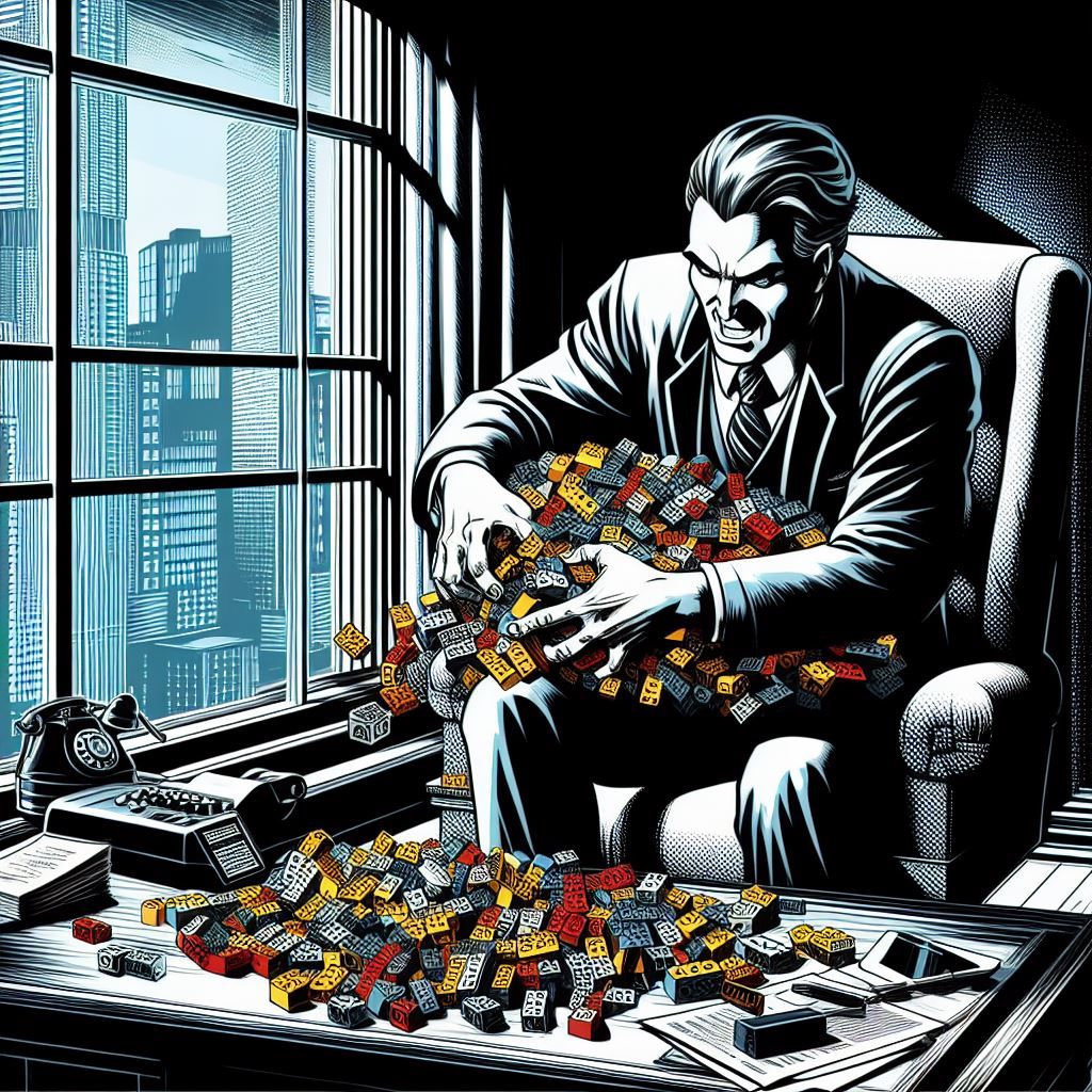
Composition: “a businessman at his table in his corner office greedily gathers a pile of lego bricks (1)”
Modifier: “comic noir expressionism (1)”
This is one of the images that I created when working on the feature image for the “Aerospace Supplier Consolidation” article. You might say that this image doesn’t belong in this article. You may be right. But I like how the lego bricks are rendered in color while the rest of the image is not. It is immediately made clear what those little blocks are and that they are businessman’s focus. Sometimes, monochrome images work better when color is selectively applied. While this result wasn’t explicitly prompted for, I have seen success with the phrase “hints of color”.
Midsummer’s Eve
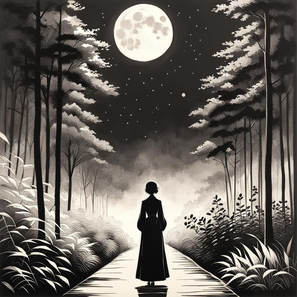
Composition: “On Midsummer’s eve, she waits in a moonlit garden, breathless in the breeze (1.3)”
Modifier: “minimalist charcoal drawing in the style of Tatsuro Kiuchi, perfect composition, masterpiece (1)”
Haikus are fun. The algorithm did well with the first two lines that describe the scene but I’m not quite sure it captured the essence of the third. Perhaps her stillness indicates her breathlessness? In any case, monochromatic images are excellent for silhouettes because the whole color scheme depends on contrast. Combine that with an appropriate modifier and artist style and you can get good results.
Preparing for the Churn
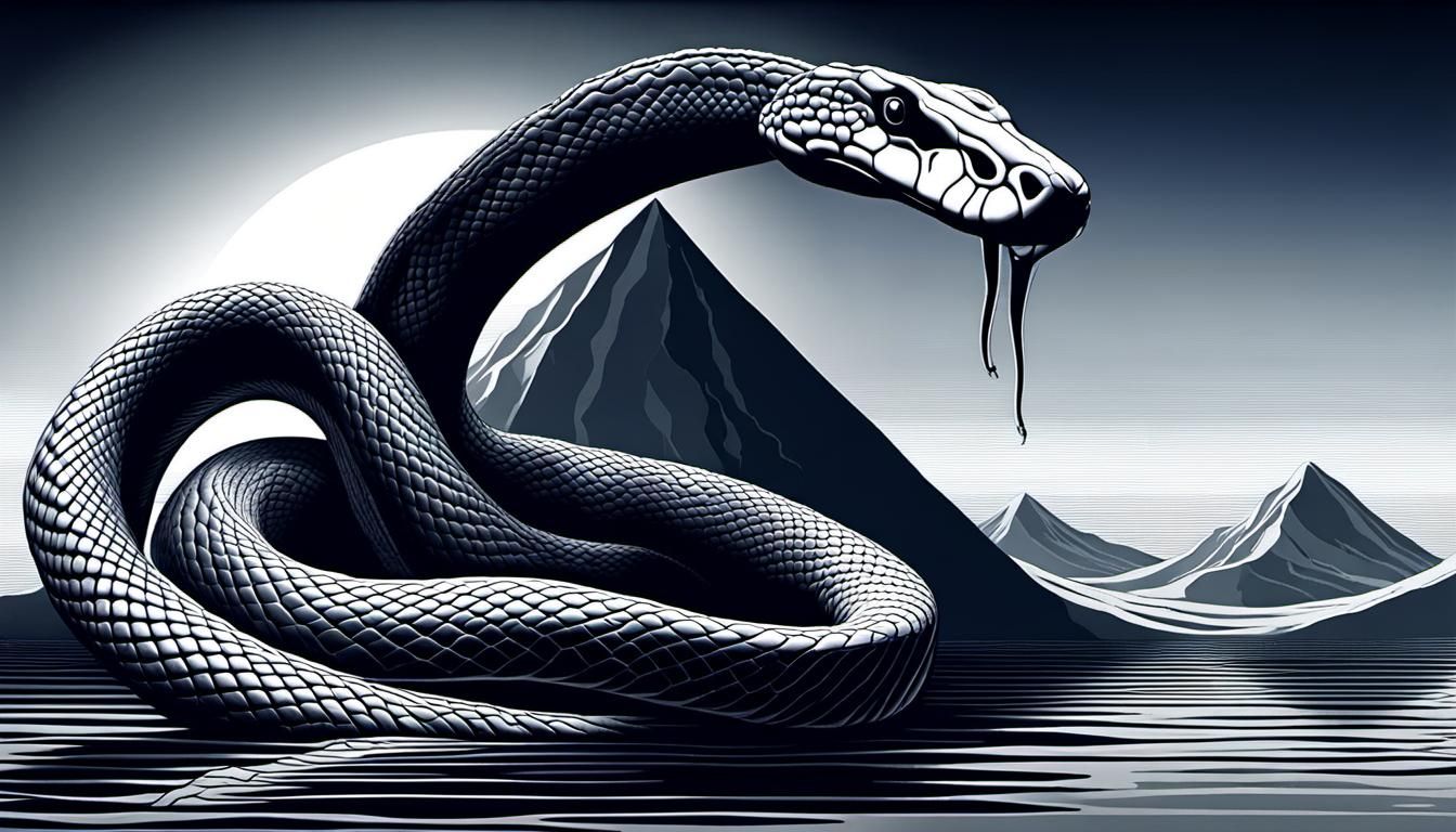
Composition: “on the vast ocean surface a colossal snake wraps around one lonely gigantic mountain, masterpiece, perfect composition (1.4)”
Modifier: “stipple, ambient occlusion, precisionism, surrealism (1)”
My intent with this image was to show the snake wrapped around a lonely mountain towering above the ocean surface. It was meant to depict the preparation for the ‘Churning of the Ocean’, a scene from the Vedic epics. Designing prompts can be daunting even when you have knowledge of different art styles because the question then becomes about choosing the best combination. “Stipple” and “ambient occlusion” work well together to describe the drawing style while “precisionism” and “surrealism” supplement the composition by adding their own flavor. I think the result is starkly captivating.
In some ways, experimenting with AI art and researching different art styles helped me appreciate the value of monochrome. The challenge will always be choosing it precisely when it is most effective.
I hope you enjoyed this week’s AI art. If this is your first time visiting my website, welcome! To view more articles like this, please visit the journal page.

